- Pivot & Flow
- Posts
- Inflation. Where We are at?
Inflation. Where We are at?
Why the mission doesn't feel accomplished
J.L. Bernstein
February 01, 2026
In partnership with
Happy Sunday
I keep seeing the same disconnect.
The headlines say the economy is strong. GDP up, unemployment low, inflation down.
The Fed is patting themselves on the back and holding off rate cuts for now.
Then I talk to actual people. We are working more hours and falling behind. Folks are putting groceries on credit cards.
Near 80% of Americans now call fast food a luxury.
Both things are true. The metrics are accurate. They're just measuring something different than whether you can afford your life. I’m going to attempt to explain what's actually happening.
The 25% pay cut nobody addressed
Inflation at 2.7%. The Fed calls that victory. Here’s what they’re not saying: prices rose 25% since 2020. That’s permanent. A dollar now buys 80 cents of 2020 goods, and it’s never coming back.
The stuff that actually eats your paycheck (housing, insurance, eggs) inflated way past 25%. Asset prices, which made the wealthy much wealthier, don’t count in CPI at all. GDP is up 4%. Unemployment is low. Consumer sentiment sits near financial-crisis lows.
People aren’t imagining things. The metrics are measuring something real. It’s just not measuring whether you can afford your life.
The 25% compounding trick
December 2025 CPI: 2.7%. Headlines call that “nearly solved.”
From January 2020 to now, prices rose 25% total. More than double the prior five years combined.
If you made $50,000 in 2019, you need $63,390 today to buy the same stuff. Median household income in 2024? $83,730. Inflation-adjusted to 2019 dollars? $83,260. Five years of “growth” got Americans exactly nowhere.
The compounding math fools people. Inflation peaked at 9.1% in 2022, fell to 3%, then to 2.7%. “Cooling inflation” sounds like relief. But prices didn’t fall. They rose slower on top of the new baseline.
That baseline is permanent.
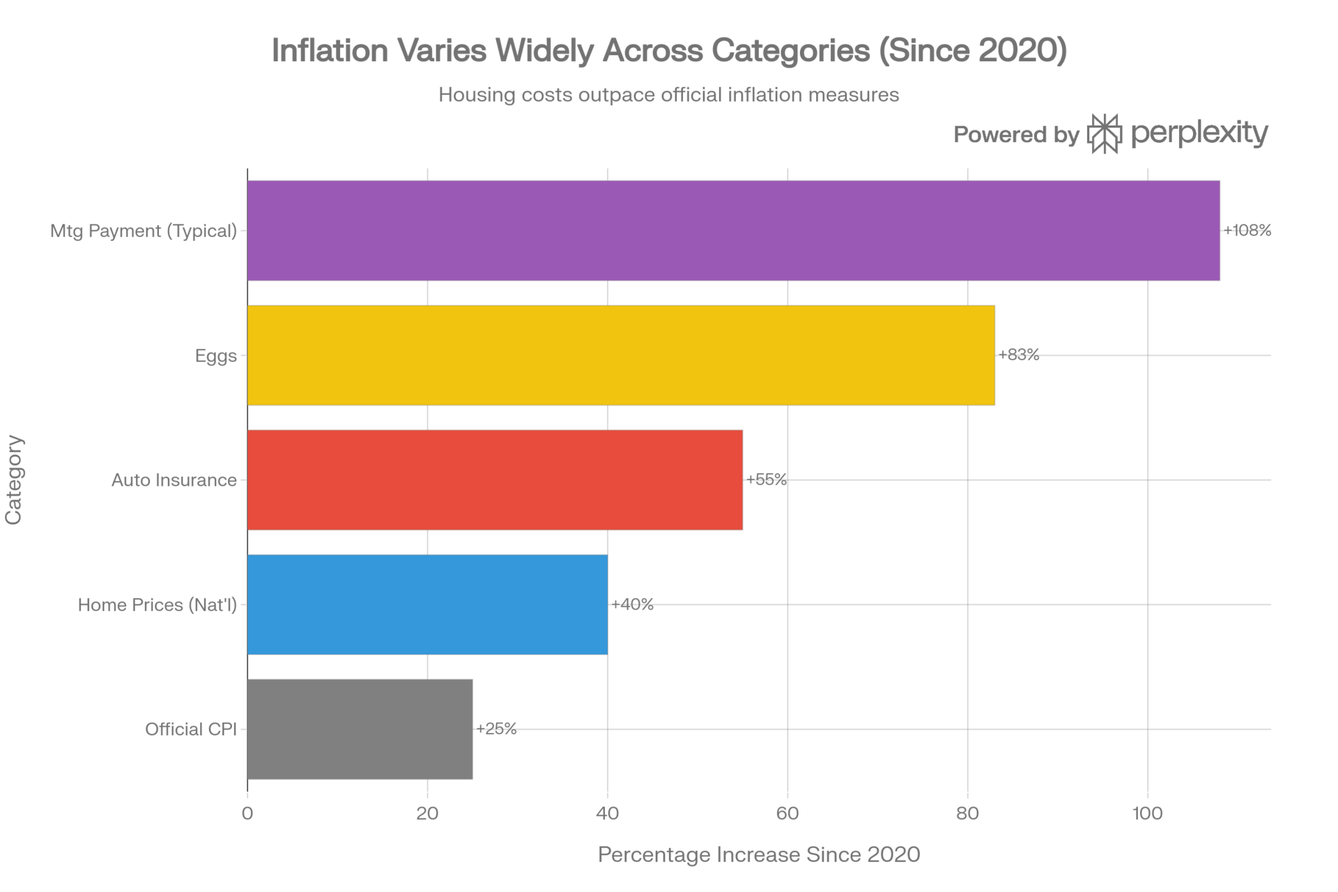
Comparison of the official CPI (25%) versus the actual price increases of major household expenses (2020–2025)
The prices that actually matter
Eggs: $1.48 in 2020. Now $2.71, after falling from a $6+ peak during last year’s bird flu outbreak. Even at today’s “lower” price, that’s 83% higher.
Ground beef: $4.90 to $6.69 per pound, with another 9% expected in 2026 as the cattle herd keeps shrinking.
Housing got hit from every direction. Home prices up roughly 40% nationally since 2020, over 50% in Florida, Arizona, and Georgia. Mortgage rates jumped from 2.65% to over 7%, adding 78% to typical monthly payments. Median mortgage payment: $1,200 in 2020, over $2,500 now. The income required to afford a median-priced home went from $59,000 to over $130,000. The average first-time homebuyer is now 40 years old.
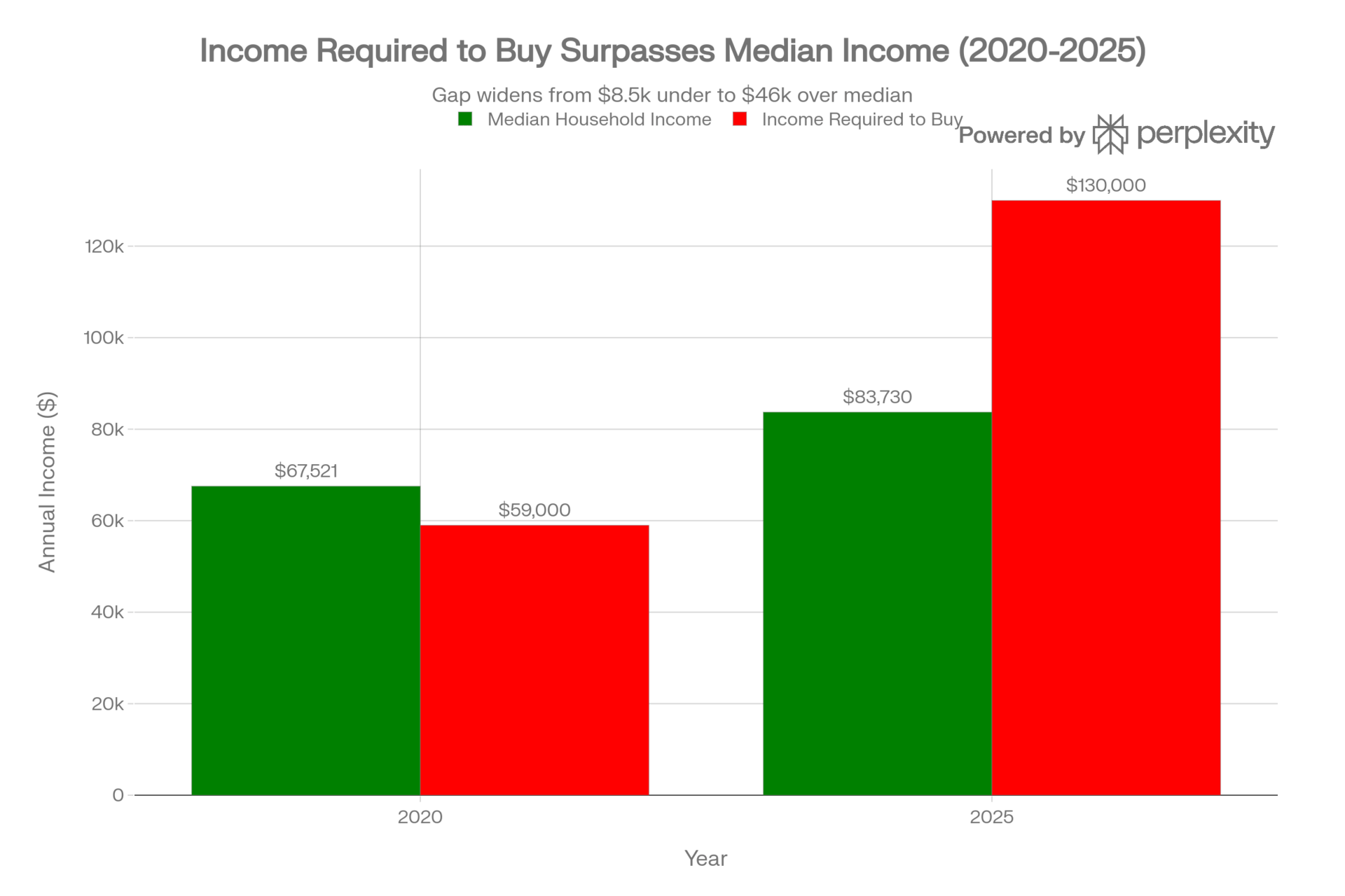
The decoupling of housing costs from incomes: In 2020, the median household earned more than the income required to buy a median home. By 2025, that relationship inverted drastically
52% of renters now spend more than 30% of their income on housing, the standard definition of “cost-burdened.” That’s 23.5 million households. 68% of Americans say it’s a bad time to buy a house. That’s the highest in 40 years.
Insurance keeps getting worse. Auto premiums up 55% since 2020. Homeowners insurance rose 24% in just the last three years, with the average policy now running $3,300 annually. In high-risk states like Florida, the average hits $3,750, and coastal properties pay far more.
These aren’t temp spikes,these are the new prices.
Why CPI misses this
The Consumer Price Index has blind spots built into its design.
The biggest one: CPI doesn’t measure what homeowners actually pay. Instead of tracking mortgage costs, it asks homeowners what they think their home would rent for, then extrapolates. This method lags actual housing markets by 12-16 months. When prices surge, CPI barely registers it. When mortgage rates jumped from 2.65% to 7%+, CPI caught almost none of it.
Other blind spots: CPI excludes interest costs entirely. Credit card APRs at 22%? Not counted. Auto loan costs up $200/month? Not counted. The formula assumes you’ll switch to cheaper alternatives when prices rise, so if beef gets expensive and you buy chicken instead, that registers as less inflation.
None of this is conspiracy. The BLS publishes its methodology openly. But CPI answers “how fast are prices changing month-to-month?” not “can I afford my life?” Those are different questions with different answers.
Today’s Sponsor
Investor-ready updates, by voice

High-stakes communications need precision. Wispr Flow turns speech into polished, publishable writing you can paste into investor updates, earnings notes, board recaps, and executive summaries. Speak constraints, numbers, and context and Flow will remove filler, fix punctuation, format lists, and preserve tone so your messages are clear and confident. Use saved templates for recurring financial formats and create consistent reports with less editing. Works across Mac, Windows, and iPhone. Try Wispr Flow for finance.
Who actually got richer
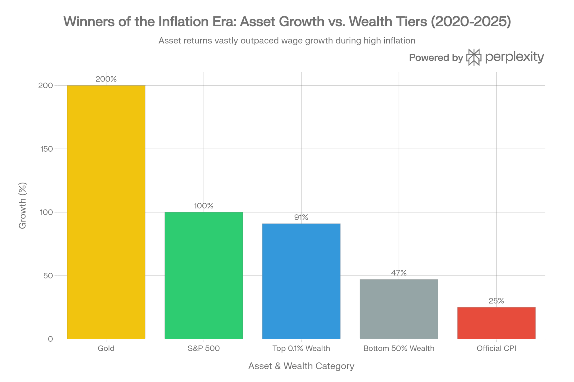
Asset inflation benefited the wealthy disproportionately. While the bottom 50% saw some growth (47%), it lagged far behind the S&P 500 (100%) and Gold (200%), explaining the wealth gap expansion
While prices rose 25%, asset prices rose faster.
The S&P 500 roughly TRIPLED from the March 2020 bottom. Home prices up over 40%. Gold up over 200% (now 300%)
If you owned assets before 2020, you got richer. If you didn’t, you got priced out.
Stock ownership follows a predictable pattern: people accumulate more as they age. Americans over 55 hold the bulk of equity wealth—> the result of decades of saving and compounding (duh). Younger Americans though, are still paying off student loans and trying to buy first homes… they hold far less. That gap has always existed, but it’s widened as asset prices outpaced wages at a faster rate.
The Fed cut rates six times since September 2024, 175 basis points total. The stated reason: labor market concerns. The practical effect: asset prices go up, which benefits existing owners. Savings account yields go down, which hurts everyone trying to build wealth.
The top 0.1% saw their financial assets grow 91% since early 2020. The bottom half? 47%.
GDP grew 4.4% last quarter. Unemployment is low. The stock market is up. By every headline metric, the economy is “strong.”
But the top 10% of households account for 50% of all consumer spending. When wealthy households spend more on travel and luxury goods, GDP goes up. It doesn’t matter whether the median family can afford rent.
Consumer confidence sits near financial-crisis lows. That’s not irrational. It’s accurate.
Stress under the numbers
The $2.1 trillion in excess savings Americans built up during COVID, over $8,000 per adult, is completely gone. Spent by March 2024. Total savings now sit below where they’d be if the pandemic never happened.
Credit card debt hit $1.2 trillion. Average balance: $7,886. Average APR: 22.3%. More Americans are delinquent on credit cards now than in 2008, and that’s with a “strong” labor market and “low” unemployment.
In the lowest-income ZIP codes, delinquency rates jumped from 12.6% to 20.1%.
Buy Now Pay Later keeps climbing: 91.5 million users. 41% made a late payment in the past year. 55% say they use BNPL because it’s the only way they can afford certain purchases.
The savings rate collapsed from a pandemic peak of 34% to 3.5%, less than half the historical average.
80% of Americans now call fast food a “luxury item.”
The two economies theory
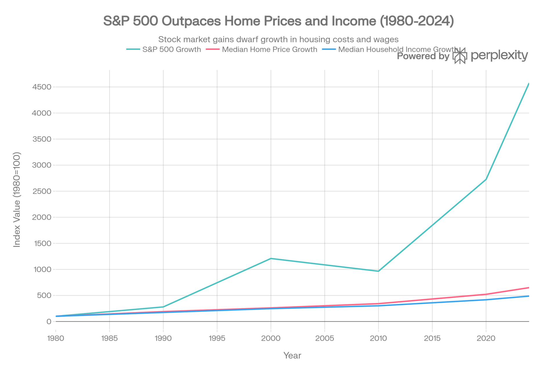
The Labor Economy: Wages and even home prices have grown steadily but slowly (4x–6x) The Asset Economy: Financial capital (S&P 500) has grown exponentially (~46x)
This chart explains why wealth inequality has exploded. If you worked for a living (Blue Line), you barely kept up. If you owned capital (Teal Line), your wealth compounded at a rate that labor could never match. Most of us reading this live within both these economies. I want to highlight 2020 in this chart.
Official inflation statistics aren’t lies. They’re answers to specific questions that aren’t the questions most Americans are asking.
CPI measures month-over-month price changes in a theoretical consumption basket. It excludes housing purchase costs, interest expenses, and quality deterioration. It answers “how fast are prices changing?” not “can I afford my life?”
The 25% cumulative price increase since 2020 is permanent. Wages barely kept pace; they didn’t recover lost ground. Asset prices rose faster than wages, concentrating wealth among people who already owned assets. The Fed’s rate cuts will push those asset prices higher still.
“Inflation is at 2.7%” sounds like victory.
“Everything costs 25% more and my savings are gone” sounds like crisis.
Both describe the same economy we are in.
Stay curious 🙂
- John